In my last post I loaded some data from Excel into Azure Data Lake and stored it in the Common Data Model format. Now I want to present that data using Power BI.
Loading the data
To get started, I need to use Power BI Desktop to build my dashboard. The first thing it asks me to do is select my data source. I don’t want to use any of the standard options of Excel, SQL Server etc., so I select the “Get data from another source” option. This gives me a huge choice of different data sources. I’ve got two possibilities to use here:
- Under the Power Platform group, I can select the (currently beta) Power Platform dataflows option. This is probably a good option for me as I loaded my data using one of these dataflows, and it gives a nice simple UI to select my data.
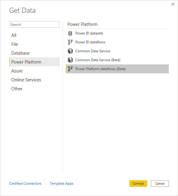
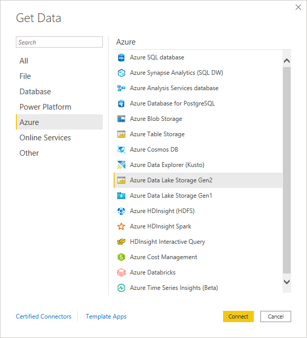
- Under the Azure group I could use the Azure Data Lake Storage Gen2 option. This is a more general option for loading data from the data lake. I’m going to use this one now as I don’t want to be tied to only using Power Platform dataflows to load all my data.
Data Lake Loading Options
Using this option, I need to know the URL of the data I want to load. This is where the UI for the Power Platform dataflows option is much nicer – there’s no help guiding me to enter the correct URL at this point.
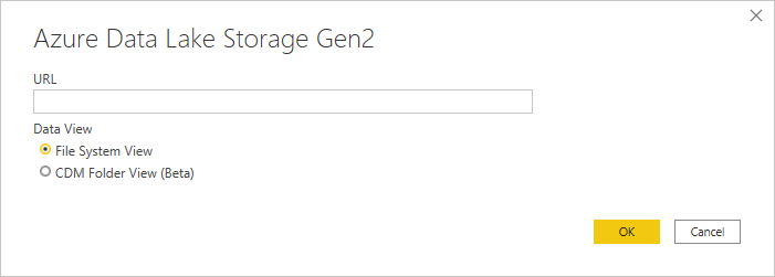
After some trial and error I’ve ended up with the URL:
https://<storage-account-name>.dfs.core.windows.net/power-platform-dataflows/environments/<environment-name>/<dataflow-name>After also selecting the “CDM Folder View (Beta)” option to make sure it uses the metadata in the CDM files to extract my data correctly (yes, all the options seem to be beta at the moment) I can see a list of the available data:
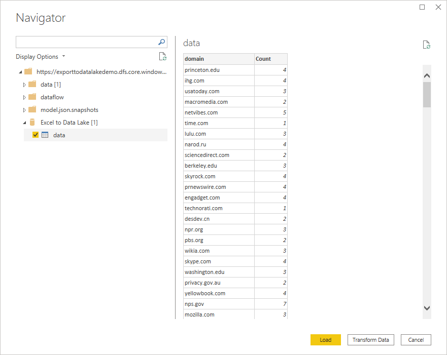
Because I used the CDM format, Power BI has been able to immediately show the correct columns and data types for this data rather than me having to describe them to it all over again.
At this point I could use the Transform Data option to apply any further transformations I need for this report, but I already did this during the initial data flow so I can just click Load. The transformations available here are the same as those in the dataflow, so by doing them up front I can eliminate duplicated work if I have multiple systems consuming the same data.
Adding a visualisation
I want to show the relative popularity of each domain name. I’m going to start by trying out a treemap to see how that looks.
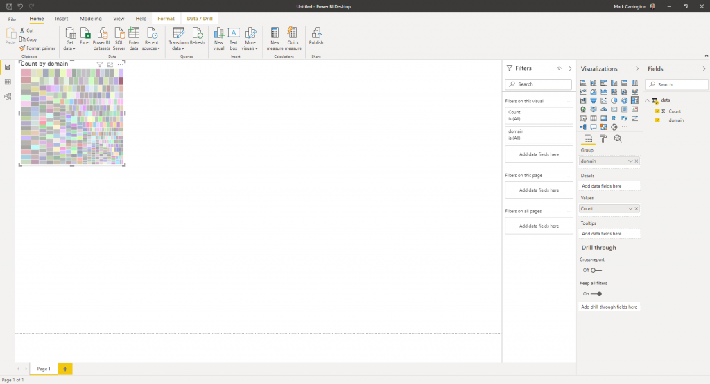
I’ve added a treemap to my dashboard by dragging it over from the list of available visualizations on the right, then I’ve added my domain field as the “Group” and the Count field as the “Values”. The result looks a bit of a mess – I can see that there are some areas larger than others, but it’s not structured enough to get any value out of it.
I could try some other visualizations to see if they work any better – column charts, pie charts etc., but I want to persevere with this one a bit longer.
More transformations
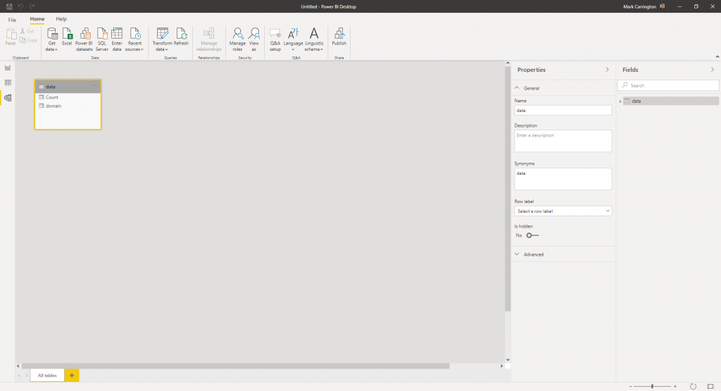
Although I already transformed the original raw data during the dataflow to go from a list of unique people with their full email addresses to a list of domain names with the associated number of people, I can still do more transformations within Power BI too. I didn’t choose to do this during the initial import, but I can go and change this now. By clicking on the “Model” link on the left hand side I can see my simple data model of one table, and click the Transform data option in the ribbon:
This gets me to the same Power Query editor I used when I was setting up the original data flow. This time I’m going to use the “Split Column” transformation again to split the domain name up further. I’m splitting it on the left-most period to get the “main” domain in one column and the TLD (.com, .co.uk etc) in another. Next I use the Rename option to give my new columns helpful names. Finally on the Home ribbon I click “Close & Apply” to return to Power BI.
After it’s refreshed the data I can go back to my report and change the settings on my treemap visualization. This time I can select my new TLD field for the “Group” and the remaining domain for the “Details”. This gives a better picture:
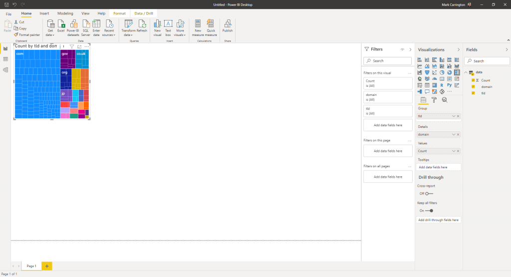
This helps me clearly see the split between the different top-level domains. Apart from the expected prevalence of .com domains, I can immediately see a sizeable proportion of government, UK and Japan domains, while still being able to drill down to individual domains within them.